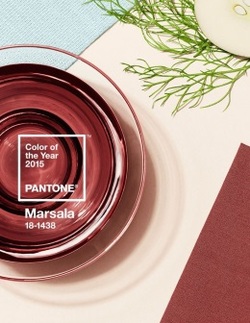
Ladies and gentlemen it’s time to rush on out and pick up some fashion accessories in this year’s color of the year. Or is it? For the last 15 years the Pantone Institute of Color has awarded one hue the prestige of being named color of the year. This year it goes to the color Marsala which is an earthy color named for wine and is—warm red with rich tones of brown. The color has already met with a great deal of criticism and has been called everything from “horrendous” to “boring” to “just plain awful”. However, the New Jersey based company is standing its ground. The Executive Director of Pantone, Leatrice Eiseman, insists the color will be extremely popular in 2015 and describes this year’s color choice as “exuding confidence and stability”. She calls it “hardy, robust, satisfying, and fulfilling” and says “At the same time there’s a certain glamour that’s attached to this color.”
Every December, when the color of the year is announced the fashion and design worlds pay close attention. The color begins cropping up in everything from fashion to beauty, from cars to appliances, kitchen gadgets to paint and wallcoverings, even consumer packaging. You name it the color seems to magically appear everywhere. This year with so much criticism already attached to the color choice, only time will tell how much this color permeates our daily lives.
If we think back over the past several years we can see how other colors of the year faired. 2012 brought us Tangerine Tango and it did seem as though Tangerine was everywhere that year. 2013 brought us Emerald Green and in 2014 Radiant Orchid took center stage. Obviously some colors lend themselves better to certain items and have more of an overall impact. All of these colors appeared in fashion and beauty as well as interior design but were not necessarily pervasive in all areas. We didn’t see a lot of Radiant Orchid cars last year for example, but I bet we will see quite a few Marsala cars this year.
Eiseman says they attempt to find a color that will leave a lasting mark on a wide variety of industries. Sephora, the makeup company has already committed to a limited edition line of makeup in this year’s favorite hue as they have in the past. This color is great for lipstick, eye shadow, nail polish, even hair color.
Men will find this color choice permeating into their ties, sport’s jackets, sport shirts, handkerchiefs, briefcases etc. Women will find it in clothing, jewelry, and all accessories. It’s a versatile shade that can be mixed and matched with what is already in your closet. Eiseman says one of the strengths of this year’s color is how well it can be combined with other colors and neutrals. She says “it’s a color that you can mix with what you already own…You can add just a touch of it…It is not the color that swallows the world.”
In the home furnishing department you will see it in paint choices, throw pillows, placemats, bedding or any kind of accent piece for the home or office. I personally like a color with a bit more punch. I am however, not upset with this color choice because I think it is a choice that will be a mainstay—not a trendy, gimmicky color that will be out as soon as it was in. No need to worry about purchasing accessories and outfits in this color because as a neutral it will stand the test of time. So this color is a thumbs UP for me.
Debbie Darling, ©2015 The Presentation Pros
Read more of The Presentation Pros blog HERE.